Simplified the booking flow so teams can find the right time faster, with less hassle.

Project
scheduling made simple
Plywood


Nesto: Rethinking the Way People Schedule Meetings
Nesto was built to cut out the chaos no endless emails, no time zone mess, just quick meeting decisions straight from your inbox.

But here’s the catch:
Only 40% of users were actually using it.
Why? The proposal flow felt confusing, calendars were cluttered, and users wanted more control over their schedule.

Problem Diagnosis

We needed to understand why Nesto wasn’t becoming part of users' daily routines. We interviewed:

  • Busy professionals who rely on back-to-back meetings

  • Remote teams who struggle with time zone coordination

  • Sales teams who juggle multiple integrations

  • Admins who manage calendars for executives

We also analyzed similar scheduling tools to compare UX flows, features, and app retention strategies.

Improving Retention

We asked: What does the ideal scheduling flow look like?
Mapping the user journey from Inbox → Calendar → Confirmation, we found gaps and redesigned around 5 core experiences:

  • Inbox – Clear details, quick actions, availability overlay

  • Dashboard – Overview, meeting stats, quick integration access

  • Calendar – Flexible views, conflict alerts, inline proposals

  • Integrations – Marketplace + auto-sync with tools like Google & Zoom


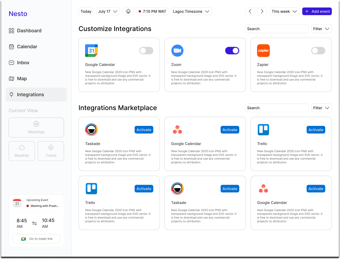
What Happened After We Launched
We made Nesto simpler, clearer, and faster. Here's what changed:

  • Inbox use jumped 47%

  • Meeting acceptances rose 32%

  • Time to schedule dropped 40%

  • App Store rating improved from 2.9 → 4.3

    People loved how easy it became to say yes to meetings.
    To keep that momentum, we:
    • Added Nesto to onboarding emails

    • Shared quick explainers in Slack & Teams

    • Highlighted it in calendar alerts

    • Refreshed the landing page and visuals to match the new flow

    Want to see every detail and explore the full UI?
    View the Figma file here.

Improving Retention

We asked: What does the ideal scheduling flow look like?
Mapping the user journey from Inbox → Calendar → Confirmation, we found gaps and redesigned around 5 core experiences:

  • Inbox – Clear details, quick actions, availability overlay

  • Dashboard – Overview, meeting stats, quick integration access

  • Calendar – Flexible views, conflict alerts, inline proposals

  • Integrations – Marketplace + auto-sync with tools like Google & Zoom


Designed the Pica Bike logo —

The motion lines and rider icon

reflect the speed and reliability

that define the service

Other Projects

Let's Connect!

Let's Connect!

Let's Connect!

© Copyright 2025. All rights Reserved.

Made by

Joan

in

© Copyright 2025. All rights Reserved.

Made by

Joan

in

© Copyright 2025. All rights Reserved.

Made by

Joan

in

Create a free website with Framer, the website builder loved by startups, designers and agencies.